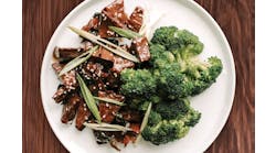
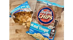
Private label products are no longer the dowdy stepsisters of national brands. In fact, the quality and variety of private label food is better than it has ever been. And to position the products vis-à-vis national competitors, private labelers are relying on packaging that's every bit as impactful as that of leading national brands.
Package graphics, in particular, are playing a central role. Retailers are turning to graphics to create a store-wide presence for their private label offerings and also to convey the quality of new premium and artisanal private label lines.
Packaging line looks
In years gone by, private label products were a cheap alternative to leading national brands, with little to no emphasis on the "brand" component of the store brand. But that's changing, and the result is a new generation of private label programs that emphasize a unified brand look across food categories.
"Retailers are asking, 'How do I create a brand that I can use across 250 categories and 3,000 SKUs so that I can tell a brand story? So if somebody is really satisfied buying my [private label] cereal and they see a similar looking package in canned goods, they'll get the same perception,' " says Todd Maute, partner at branding firm CBX (www.cbx.com), New York.
"There has been a trend as of late where retailers are going more toward 'line looks,' which are a common theme across all categories," Maute adds. "The primary driver behind line looks is … to build a common story for the brand."
This strategy drove a recent private label repositioning initiative at Longo's (www.longos.com), a Vaughan, Ontario-based grocery. Longo's is a family-owned company with 25 stores in the greater Toronto area. Working with integrated retail agency Watt International (www.wattintl.com), Toronto, Longo's executed the refresh, which resulted in a two-tier private label program.
Longo's new mid-tier private label offerings are "value" products — quality but everyday products with lower prices than national brands. The other tier, Longo's Signature, is a premium product line.
Products in both tiers are merchandised in many departments throughout the store, and the package design for each tier overcomes inconsistencies in fonts, imagery, design elements and logo placement on Longo's previous private label packaging.
Unique design elements, including color schemes and typefaces, differentiate the packaging of each tier from the other — and from national competitors. Even the Longo's logo is different between tiers. The mid-tier logo is the Longo's name in white on a ground of red, with two small green leaves (in place of an apostrophe) to connote freshness.
The Signature logo, in contrast, uses a handwritten font and round stamp. The idea is that "our family endorses it, because it has that Longo Bros. signature stamp," explains Jenny Longo, director of private brands. The Signature logo and package design were created to elevate the brand and deliver a "premium look and feel," she adds.
Longo's private label products currently comprise about 700 SKUs, about 90 percent in the mid-tier and 10 percent in Signature. The company started its private label revamp in 2009, and in the two years that followed "revised everything," Longo says. That included introducing 400-plus new SKUs, refreshing some existing SKUs and discontinuing others. "The process was intense, and it was a huge undertaking."
The results of the tiered private label program are encouraging. Longo's reports that its private label penetration in the Canadian market rose from 4.6 percent in 2008 to 8.2 percent in 2011. By 2017, the company hopes the figure will grow to 20 percent.
"I haven't come across a private label line that really understands its niche the way Sunflower does," says Steve Beckman, former vice president of creative services at Vertis.
"They're not an 'organic store.' They do have a lot of organic products, but that's not the mainstay of what they are. It's a farmers' market." Thus, freshness and messages like "from our farm to your table" are fundamental to the Sunflower store brand.
Beckman points out that at a traditional farmers' market, shoppers can talk with farm-stand marketers to learn about products and get recommendations. However, "you can't do that in a store. So we tried to get the products to speak for themselves, and one of the ways we did that was with really innovative copy writing and informative [elements] on the packaging. Another was with the introduction of QR codes."
The quick-response (QR) codes connect shoppers in real time, via their smartphones, to web-based product information that could influence purchasing. Sunflower is purportedly one of the first private labelers to use QR codes on packaging.
Boxes of Sunflower All-Natural Cereal display a QR code on-pack, but not all Sunflower products do. "I don't typically recommend QR codes on packaging," Beckman says, because in many cases relevant information can be communicated better using text, graphics and other on-pack design elements.
So Sunflower "products that don't have as full of a story" don't get an on-pack QR code, he says. But "products that are truly unique are getting it." For those that do display a QR code, Sunflower has developed linked web content that educates shoppers about, for example, where the products or their ingredients come from.
Premium and artisanal products
In addition to the shift to store-wide private label lines, industry observers are noticing continued growth of premium and artisanal private label products.
"Premium [private label] is, in my opinion, a trend that will continue to grow, because the goal is to offer a better product than exists in the category today, still at a better price point than the comparable national brand in the category," says CBX's Maute. "So it's a nice way for retailers to differentiate themselves in the marketplace."
For these high-end products, packaging that accurately conveys the item's quality is essential. The Great Atlantic & Pacific Tea Company, Inc. (www.apfreshonline.com), Montvale, N.J., leveraged package graphics to communicate artisanal qualities when it launched the Jersey Tomato Sauce line under its Food Emporium Trading Company private label. Vertis Communications designed the Jersey Tomato Sauce packaging for A&P.
The four products in this product line are made in small batches by "two guys from New Jersey who are passionate about tomatoes," says Beckman. "They buy the Jersey tomatoes the second they're ripe and make this sauce at that time. So it has a lot of artisan craftsmanship about it, and we wanted to bring that out in the design. Also, it's very Jersey and we wanted it to have a little bit of Jersey attitude, as well."
To balance those objectives and stand out on-shelf, the designers chose a weathered look for the brand name and tomato illustration — plus a prominent "Made with Jersey Fresh Tomatoes" icon on the front of the package. The 25-oz. glass jars are decorated with pressure-sensitive labels.
Directions Marketing designed Carmella's package graphics, and WS Packaging Group Inc. (www.wspackaging.com), Green Bay, Wis., printed the labels using a digital printer. Digital printing is geared to low-volume, high-quality print runs and is much more cost-effective for small-batch projects than high-volume, high-quality printing technologies such as rotogravure.
"We chose an off-white uncoated paper stock traditionally used for wine labels, which combined visual texture as well as an in-hand feel," says Aaron Graff, art director at Directions Marketing (www.directionsmarketing.com), Neenah, Wis. "The design was kept clean and simple, highlighting a primary ingredient. Both of these cues combined to offer a fresh approach to the category by reflecting the simple, natural and handcrafted essence of the Carmella's sauces."
Graff adds the pressure-sensitive label stock's visual and tactile attributes "work together to portray Carmella's as a premium handmade sauce."