“A trend that we’re seeing is a lot more transparency in packaging design to cue freshness [and] allow the consumers to see more of the product,” says Lisa Baer, senior director of market innovation at Packaging Technology Integrated Solutions, a division of Havi Global Solutions, Downers Grove, Ill.
In focus groups and other research, “Consumers talk about wanting to see the product, wanting to check it, wanting to trust the ingredients," she adds. "If they can see it, there’s a higher trust factor.”
One of the best recent examples of the transparency trend comes from Morton Salt Inc., Chicago, which recently launched Morton Grinders. The product comes in three varieties — Sea Salt, Black Peppercorn and Roasted Garlic with Sea Salt — and the package is a jar with a built-in grinder.
A full-body shrink label displaying brand and product identification is designed to be removed when consumers are ready to start using the product. A perforated strip running vertically down the back of the label makes discarding it fast and easy.
Sans label, the package is the essence of simplicity: a colorless glass jar with a slim, ergonomic shape. The stylish package provides a 360-degree, top-to-bottom view of the seasonings, which are attractive in their own right. The presentation lets consumers know the brand has nothing to hide.
Bottles displayed behind the bar at a restaurant, pub or nightclub sometimes look light years different from their cousins sitting on retail shelves. In the case of an on-premise bottle for Ballantine’s Finest Blended Scotch Whisky, “light” is the operative word.
In a bid to attract the millennial market, Ballantine’s brand owner Pernod Ricard, Paris, chose a decorating method that lets bartenders literally turn on the bottles to create an instant light show.
Electroluminescent labels on the bottles are programmed with three special effects. One effect makes light pulse across the front of the bottle, simulating a musical beat. The others highlight the “B” in the Ballantine’s name, drawing the script “B” using a line of light, for example.
Used as an attention-getter for the brand in the low lighting of bars and clubs, the dance of lights on labels is quite dramatic when coordinated across a series of bottles displayed side by side.
London-based Parker Williams Design Ltd. designed the package, working in partnership with Kandoo, Hong Kong, to implement the electroluminescent technology. The bottle is distributed globally.
Topping off the package is an unobtrusive grinder. The grinder fitment is white for the salt product and black for the peppercorn and garlic grinders. In all cases, a round, snap-fit overcap protects the grinder mechanism when not in use.
“As interest in the culinary world continues to grow, and as kitchens become more upscale, we saw an opportunity to offer consumers a more contemporary grinder product that really adds to their culinary experience in their kitchens, and it also adds to their décor,” says Denise Lauer, director of communications and brand strategy at Morton Salt.
“We’re seeing this opportunity to add something into the kitchen that’s both functional and fashionable,” she adds, noting that after the label is removed the “grinder bottles sort of blend into your kitchen décor.”
The Morton name and iconic salt-girl logo are debossed into the overcap, and this is the only branding that remains on the package after the label is removed. “It’s a more subtle brand approach that complements the design of the overall product structure, we believe,” says Lauer.
The clarity and weight of the glass jar adds to the premium look and feel of the product; Morton has sold grinder-style packages before, but Morton Grinders are its first made of glass. The package’s transparency also differentiates the offering from other salt packages, including cartons, tubes and even other grinders.
“The Morton salt grinder package embodies [several] of the trends we’re seeing,” notes Baer, including not only transparency but also product/packaging elevation. The latter refers to elevating the experience of a product by using a package that is more than simply functional.
The grinder provides “a great interactive element. This innovative closure that is really a grinder allows consumers to interact with the product in a new way, and the overall structural and graphic design has elevated this to be elegant enough to put on your dinner table [or] on your stove,” Baer explains.
TricorBraun, Oak Brook, Ill., designed the Morton Grinders package structure. Akimbo Group, Chicago, created the package graphics.
‘What you see is what you get’
Beech-Nut Nutrition Co., Amsterdam, N.Y., opted for maximum transparency when developing a package for its new 100% Natural line of baby food.
The category-disrupting glass jar has a rounded bottom and is decorated with a transparent pressure-sensitive label with minimal graphics. Owens-Illinois Inc. (O-I), Perrysburg, Ohio, designed the custom jar.
“The simplest way to describe the new Beech-Nut line is, ‘What you see is what you get,’” says Andy Dahlen, vice president of marketing and sales. “The line is the closest to homemade, using just real, whole fruits and vegetables and nothing else. The clear jar design is symbolic in the sense that we have a transparent approach in everything that we do. I'd describe this new line as simple, real, fresh and flavorful.”
The 100% Natural product line includes 40 flavors with unexpected ingredients like avocado, quinoa and pomegranate. The jars’ fill size is 4.25 oz., or 120g.
During product development, Beech-Nut conducted qualitative research with several thousand millennial moms across the U.S. From the research, “we learned that moms wanted to see more of the product when at shelf, as their primary driver is control. They want to know exactly what they are feeding their babies,” Dahlen says.
“Moms like our new packaging design because they can see what they are getting in both color and texture, it clearly tells them what it is and the stage it falls into, and glass helps cue fresh and homemade,” he adds. “You can’t make pouches at home.”
From a structural standpoint, the honeypot-shaped jar “achieved the aesthetic disruption that Beech-Nut was looking for by adding personality and character, while still providing functional benefits,” says Raul Paredes, director of new product development at O-I.
“The new shape, with its low shoulder and tapered sides, provides a better, more ergonomic grip in the hand,” he adds. It’s also easier to spoon all the product out of the jar, and the tapered sides provide more surface area (than a straight-walled jar) to display the product.
The package’s graphic design emphasizes simplicity. “We found that baby food packaging is often covered in busy labels that try to convey all kinds of information but just end up overwhelming the consumer. Our idea was to maximize the visibility of Beech-Nut’s natural, colorful baby food by using simple graphics that let the food speak for itself,” Paredes says.
A juicy package
Welch Foods Inc., Concord, Mass., went with reduced graphics and an increased product-viewing area when developing the package its new Farmer’s Pick by Welch’s 100% Juice line. The product comes in three flavors: Concord Grape, Mango and Blackberry.
Product visibility is a key differentiator, as Farmer’s Pick juices are among the few unfiltered mass-market juices available in a shelf-stable package. The cloudy appearance of Farmer’s Pick juices flags the products to savvy consumers as less processed than the crystal-clear juices on the shelf beside them.
To maximize product view, the custom-designed plastic bottle is decorated with a wrap-around label that takes up less real estate on the front panel than Welch’s other juice labels.
The Farmer’s Pick package design supports the line’s positioning as “fresh picked.” The products contain no preservatives or artificial ingredients, and they are cold-kettle batched. According to the brand owner, this type of processing preserves the juices’ flavor and aroma.
“They’re really going after this whole movement toward freshness, toward wellness … and trying to express that through the packaging,” says Havi’s Baer. “They were trying to more closely match the structural packaging with the brand DNA for Welch’s. The packaging cues are more about more transparency and showing off the freshness of the product.”
The bottle’s structure stands out on-shelf because, unlike the preponderance of products in the category, it is rectangular. This easy-to-grip shape also provides more efficient case packing, shelving and storage in the consumer’s refrigerator or pantry. The bottle’s fill volume is 46 oz.
The Farmer’s Pick bottle is made from polyethylene terephthalate (PET), and the label is oriented polypropylene (OPP) with a clear matte coating. “Using a matte finish was a first for Welch’s packaging and stays consistent with the authentic positioning of the product,” says Karen Mitchell, director of marketing, strategy, at Welch’s.
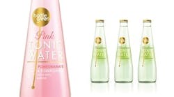
Colorless glass for Bottlegreen
For Bottlegreen Drinks Co., Gloucestershire, England, a colorless glass bottle was the ideal choice for a new line of premium tonic waters.
In addition to displaying the pastel shades of the products — pink for the pomegranate flavor and green for elderflower — colorless glass distinguishes the tonic waters from Bottlegreen’s cordials and sparkling pressé soft drinks, which are filled into similarly shaped green glass bottles.
Package graphics on the transparent polyethylene front label were designed to complement rather than compete with the view of the product. This was a feat, considering that Bottlegreen Tonic Water is sold both at retail and on premise. The products are available in the United Kingdom at Sainsbury, Tesco and other supermarkets, and at pubs and upscale gin bars.
Retail packaging for the products is a four-pack of 175-ml bottles. The sides of the die-cut, wraparound paperboard carrier are open, providing a good view of the product.
For visibility in dark pubs and bars, package graphics feature a metallic-gold brand mark in the shape of a cocktail stirrer, with product identification in white text. A gold-tone bottle cap completes the premium presentation. London-based brand-design agency Ziggurat Brands designed the packaging.
The finished design, says Ziggurat managing director Adrian Collins, is a package that creates “stand-out in a crowded space, whilst retaining the naturally stylish attributes of the Bottlegreen brand.”


