For Carla Hall, celebrity chef and owner of Carla Hall Petite Cookies, Silver Spring, Md., it’s all about love. The tagline for Hall’s brand is: With love, Carla Hall. “Whatever I do, it really is from the heart and with love,” says Hall, who is a co-host of the television series “The Chew” and has competed on “Top Chef.”
Her bite-sized, artisanal cookies are all made by hand. Flavors include sweet and savory varieties such as Almond Ginger Cherry Shortbread, Chocolate Hazelnut Praline and Cheddar Pecan.
Hall’s dedication to cooking with love comes through in her recently redesigned logo. The design is a heart containing the chef’s initials. Designed by General Design Co., Washington, D.C., it's the central graphic element on Carla Hall Petite Cookies’ packaging. The design is printed on pressure-sensitive labels, which are placed on the company’s various packaging components. These include plastic cups, cellophane bags and paperboard boxes.
Hall’s bakers hand-pack the cookies into the transparent bags and cups. Billie-Ann Plastics Packaging Corp., Brooklyn, N.Y., supplies the cups, which are cylindrical, with end caps at top and bottom.
The cups come in two sizes. The standard size holds 6 oz. of cookies. A smaller cup, which holds 3 oz., is used for gift packs containing assorted cookie flavors. A new wedding favor/corporate gift package consists of a single 3-oz. cup in a box.
For Whole Foods Market stores only, the company packs 12 oz. of cookies into stock square tubs made of industrially compostable, corn-based polylactic acid (PLA). In all cases, the rigid plastic packages protect the cookies while providing a 360-degree view of the product. Carla Hall Petite Cookies originally had used tins to package its products but switched to clear packaging to let consumers see the cookies before they bought.
In switching away from tins, Hall says: “We knew we wanted something light — something that was natural looking and … friendly.” The plastic packaging components are all stock parts, so they are cost effective, as well.
‘Nostalgic and whimsical’
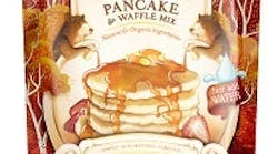
“We wanted to bring something sort of nostalgic and whimsical, not rooted into a particular time or place,” explains COO Lizzi Ackerman, who is also known as Dr. Pancake. The hand-drawn illustrations create the sense of “a different world at Birch Benders [and] a timelessness,” she adds. “We wanted something that was classic, and also really fun.”
Birch Benders worked with agency Moxie Sozo, Boulder, Colo., on the redesigned packaging. Artist Charles Bloom drew all the illustrations.
The flagship package at Birch Benders is a jar; to make pancake or waffle batter, the consumer simply adds water to the jar and shakes it. The small jar, which makes three to five pancakes, is made of glass; the larger jar, which makes about 16 pancakes, is made of polyethylene terephthalate (PET).
As part of the rebranding, the company added pouches to its packaging lineup. These include a 16-oz. stand-up pouch and a 24-oz. resealable, box-style pouch with flat bottom and substantial side panels. Innovative Packaging Solutions, Temecula, Calif., supplies the pouches.
The new illustrations appear on Birch Benders’ jar labels and the pouches, which provide a good-sized billboard. “The pancake category is not known for innovative branding,” says Ackerman. “It’s not the most exciting category, and we wanted to change that. We wanted to offer something that was visually stunning and that also tastes awesome and is super-easy to make. We’re the only natural and organic, just-add-water pancake mix.
“We didn’t want to just look at pancakes for inspiration," she adds. "We were looking at all sorts of categories in the grocery and beyond and trying to offer something really fun and unique. We call ourselves a micro-pancakery partly because we are so inspired by micro-breweries and all those craft breweries that have cool branding. We were looking at a lot of beer labels.”
Bring on the bacon brittle
Package design also plays an essential role at Sir Francis Bacon Confections, Atlanta, positioning the artisanal candy maker as upscale but not unduly serious about itself.
The company makes Sir Francis Bacon Peanut Brittle — yes, that’s right, peanut brittle made with bacon — as well as Sir Francis Bacon Toffee Bars, which are enrobed in dark chocolate. All the products are made in small batches and hand-packed.
Sir Francis Bacon’s co-proprietors Bob Coyle and Steve Saari leveraged their background in advertising and marketing to create a unique brand identity for the distinctive products. The paper labels on Sir Francis Bacon Peanut Brittle boxes feature a 17th century portrait of the historic Sir Francis Bacon embellished with a Halloween pig snout covering his nose.
“We refer to that as ‘tongue-in-cheek sophistication,’ ” Saari says. “The artwork is a little serious without that pig nose. But we put that little nose on him, and suddenly it’s a lot more light and fun.” The snout, together with the predominance of the word “bacon” in the brand mark, also conveys what the product is: a confection made with bacon.
Using an archival image of Sir Francis Bacon also reinforces the product’s upscale quality. “There’s a hand-craftedness to [the portrait] and … a sort of new-Old World feel,” Saari says. “Those cues put us in the right zone in terms of quality.”
Package structures for the brittle and toffee bars are straightforward. For both sizes of brittle (3 oz. and 8 oz.), the confection is hand-packed in a plastic bag, which is then heat sealed and placed on a bed of crinkle paper inside a paperboard box. A paper label with package graphics is used to seal the box.
The toffee bars, which weigh 3 oz., are placed in a foil pouch and then packed in a printed box.
Unbleached kraft paper is used for the boxes and crinkle paper, giving the packaging a down-to-earth sensibility. “It’s important that the natural design and natural feel of the product comes through for this particular audience,” says Coyle.
“Packaging is the predecessor to any sale,” he adds. “Without it, you don’t get people excited or energized about what you’re offering.”
‘Playful and tasty’
Going with a luxe look, Magnifico Giornata, La Jolla, Calif., uses bottles with a metallic-gold finish for its infused sparkling wines, which launched in November 2013.
The glass bottles are sprayed with a ceramic coating and then fired. Later, the bottles are silk-screened with the Magnifico Giornata name and logo plus the flavor: Ginger Pêche, Lavender Honey or Grapefruit Blanc.
The brand owner “wanted a very luxurious package [to] … create an everyday sparkling experience that was very high-end,” says David Schuemann, owner and creative director of CF Napa Brand Design, Napa, Calif. His firm designed the Magnifico Giornata package. The idea was a “celebration of every day.”
The stylish, fashion-forward brand targets women, and details of the package design support that positioning. The black, matte foil capsule covering the cork and cage is textured with a cross-hatched, embossed pattern that carries over to the molded plastic hang tag adorning the front of the bottle.
The hang tag is attached to the bottle with a black ribbon, and the tag and foil are both hot-stamped in a color corresponding to the flavor in the bottle. On bottles of Lavender Honey, for example, the logo on the foil and the Magnifico Giornata name and flavor on the hang tag are hot-stamped in purple.
“It’s definitely fashionable,” says Schuemann. “Something that feels very special, even though it’s [for] every day.” Magnifico Giornata is Italian for Magnificent Day, in fact.
The product launched in a 750ml bottle, and this summer, the brand owner added a 375ml bottle to the lineup.
The natural approach, with a dollop of fun, is also the focus at Jen & Joe’s Cookie Dough, Los Angeles. The company recently redesigned the packaging for its gourmet, ready-to-bake cookie dough, which is sold frozen.
For packaging, the company uses a flow-wrapped paperboard tray inside a paperboard carton. Each carton contains 12 dough balls, and fill weight is 12 oz. The new packaging is set to roll out in September.
Jen & Joe’s Cookie Dough comes in six flavors: Chocolate Chunk, Snickerdoodle, Oatmeal Toffee, White Chocolate Wasabi, Lemon Drop and Chocolate Spice. High-quality ingredients are a point of pride for the company, which touts its use of real eggs and butter and the absence of artificial colors, flavors, additives and preservatives.
That’s significant, because on the new packaging all the ingredients are listed prominently on the carton’s front panel. The FDA nutrition panel, with extended information for enriched flour and complex ingredients like prepared horseradish and white chocolate, appears on the back of the carton along with allergy warnings.
“We know that the words ‘all natural’ … have become meaningless,” says President Jen Laska. "We didn’t want to put words on the package that the consumer doesn’t trust anymore.”
She adds, “What’s the first thing [consumers do] when they see claims on the front of a package? They pick it up and turn the package over to see what’s in the ingredients list. So I thought, why don’t we give them everything they need to know upfront? I have nothing to hide in this cookie dough, so let’s show them that everything they want to see is right there on the front.”
The packaging for Jen & Joe’s products also has a lighter side. It features vibrant colors, an uncluttered design and a playful attitude, including the image of a cookie with a mouth-shaped bite taken out of it. Hull + Honeycutt Marketing and Design Inc., Sacramento, Calif., created the package graphics.
“The flavors are gourmet, but we don’t want it to look stuffy,” Laska says. “We want it to be fun and playful,” as well as colorful, “because children and adults alike appreciate color.” The bright colors of the cartons are coded to the various cookie flavors.
“I put wasabi in a cookie — I can’t take myself too seriously,” Laska adds. “We keep it playful and tasty.”


