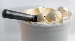
A dual-compartment pouch separates the cheese from the seasonings (right) in Kraft's new Fresh Takes, but the paperboard sleeve aptly displays both.
Package designers are thinking outside the box, so to speak, as they create packaging for new food products. In the latest crop of package designs, from processors ranging from multinationals to start-ups, providing a view of the product — without sacrificing freshness, flavor or texture — is a recurring motif.
Kraft Fresh Take, a new meal kit from Kraft Foods Inc. (www.kraftcheese.com), Northfield, Ill., leverages the transparency of a dual-compartment pouch to show off the product's two ingredients. One compartment holds shredded or crumbed cheese, and the other holds seasoned bread crumbs. The pouch is folded in half and tucked into a paperboard sleeve that displays the cheese and crumbs.
"That inner bag is the first 'aha' of this project. In one bag we're able to create two different compartments that hold the moisture and the freshness of the cheese on one side of the bag while maintaining the crispiness of the spices and the breadcrumbs in the other" compartment, says Arthur Sevilla, brand manager for Kraft Natural Cheese.
The seal between the two compartments remains intact until the consumer opens the pouch to use the product. After the inner seal is broken, the consumer mixes the cheese and crumbs together and drops pieces of chicken, pork or fish into the pouch for coating prior to baking.
Because the product is merchandised in the shredded cheese section of the dairy case, Kraft also needed a package that would be compatible with space limitations and would position the product as a meal kit in a sea of cheese. The paperboard sleeve plays a central role in accomplishing those objectives.
"The sleeve was designed to have cutouts along the side, essentially asking consumers to take a peek beyond the sleeve," Sevilla continues. He adds that the sleeve cues customers that the product is a "meal kit or meal solution" rather than simply an ingredient, like cheese. "Most kits are in a box. A 'box' was required to differentiate ourselves in the [product] set where we would live," he says.
Designing food packaging for the real world requires careful consideration of everything about the package, including not only consumer needs and perceptions but also production and distribution realities.
At design firm Webb deVlam (www.webbdevlam.com), Chicago, learning about a package's business and operational requirements is part of the pre-design discovery phase.
Philip Hague, managing creative director at Webb deVlam, explains that the "business piece" of the discovery phase focuses on understanding "all the touch points around the technology, supply chain [and] the different stakeholders who are going to have to bring the innovation to life."
He adds, "We really work to understand what is keeping all these different stakeholders up at night, in each of their different disciplines. It might be the manufacturing line. Where are the bottlenecks in the manufacturing line? And what are the equipment constraints that are really embedded in the way the product is produced? It might be retailers. Maybe retailers have concerns about how the product is stocked."
Facility tours, in which the designers watch the filling lines in operation, provide insight into the production and equipment aspects. Although the designers often are not allowed to take photos in plants, they do take notes regarding key touch points for packages, such as capping, and they talk to the plant personnel.
After the fact, the designers may create a 3D rendering of the filling line (using computer-aided design software) to show the touch points and provide context for package design.
"When we look at these machines … including] the packaging components, we can get a sense of what's driving the [capital] investment," Hague explains. "Maybe there's a way to keep the base machine but change one roller or one die and get differentiation in the package."
Webb deVlam counsels processors to take advantage of the equipment procurement cycle, when possible — synching package design with new equipment purchasing, in other words.
Many times, however, getting creative with existing equipment is necessary. "If there's innovation we can do with what the client already has in place, that's a great thing to leverage from a business perspective," Hague says. "We want to make sure that we're not missing any opportunities for innovation."
The sleeve also makes it possible to fold the large pouch in half, "minimizing the space we need within our dairy set," Sevilla explains. The sleeve has a peg hole, so the package can hang in the dairy case and occupy the same amount of space as an 8-oz. bag of shredded cheese. Or the package can be displayed upright; the bottom of the sleeve is flat.
For the Fresh Take product launch, which began in December 2011, Kraft created a pusher tray system that keeps the product vertical and reinforces its positioning as a meal kit. The display sits on a shelf adjacent to shredded cheese and has a transparent glass front, so the sleeves are completely visible to consumers.
Kraft created the structural designs in-house for both the multilayer-plastic pouch and the sleeve. Spring Design Partners (www.springdesignpartners.com), New York, created the graphics for the sleeve. Kraft Fresh Take launched in six flavors.
A new look at frozen fruit
In the freezer case, Dole is showing off its new single-serving fruit products. Dole Frozen Fruit Single-serve Cups hold 3 oz. of frozen "All Natural Fruit" and are sold in two-packs.
The product line, which includes Blueberries, Sliced Strawberries and Tropical Gold Pineapple, is available in select retail and Walmart stores and should be in national distribution in April.
In contrast to conventional frozen-fruit packaging — opaque pouches, that is — Dole's frozen-fruit cups make transparency an essential design feature. The fruit, packed in polypropylene cups, is completely visible. And the paperboard multipack sleeve is designed with a window to let consumers view the packaged fruit at point of purchase. That visibility communicates a key product benefit: the fruit's quality.
"Dole uses a proprietary patent-pending process that removes water from the fruit prior to freezing in order to diminish cell damage during the freezing process," explains Vanessa Beltran, business manager at Dole Packaged Foods LLC (www.dole.com), Westlake Village, Calif. "The resulting fruit exhibits improved appearance, taste and texture compared to traditional IQF [individual quick frozen] fruit."
She adds that the Nature Lock logo displayed on the front of each multipack "is Dole's way of letting consumers know that we've locked in all the nutrients of fruit at its peak moment to ensure consumers are getting the finest fruit available."
Dole chose polypropylene for the cups not only for visibility, but also for product protection. Polypropylene stands up well to freezing and "performs very well throughout the supply-chain process, ensuring we deliver the best product for our consumers," Beltran says.
Dole developed the structural package design for its Frozen Fruit Single-serve Cups in-house and worked with The DuPuis Group LLC (www.dupuisgroup.com), Westlake Village, Calif., on package graphics.
Tea tin with a window
The combination of product protection and transparency also is fundamental to the design of packaging for Tiesta Tea (www.tiestatea.com), a young company based in Chicago.
Because Tiesta's custom-blended, premium-priced teas incorporate delicate ingredients such as kiwi bits, eucalyptus leaves, tangerine pieces and rose petals, freshness was a concern as the company designed its packaging. But Tiesta also wanted consumers to see the tea inside the package.
The company's solution was an aluminum canister designed with a rigid plastic window and a gasket-and-clasp closure system. Planet Canit LLC (www.planetcanit.com), Highland Park, Ill., supplies the package.
"Being able to see what you're getting before purchasing was a big plus" with consumers, says Patrick Tannous, Tiesta's chief operating officer. As a secondary benefit, after buying the product consumers can use the window to see how much tea is left in the tin.
Tannous adds that the window engages consumers and quickly communicates the unique nature of Tiesta's products. When consumers "can see all the exotic pieces and all the different herbs and ingredients that are going on, that [creates] a more exotic and unique experience."
To ensure product freshness and protect the tea from light, Tiesta uses an ultraviolet (UV)-protective plastic for the canister's window. "Windows were a great feature, but we had to make sure [they weren't] going to interfere with the quality of the tea or the freshness," says Bobby Moynihan, Tiesta's creative director.
Tannous explains that all Tiesta blends are "comprised of three-plus ingredients, and they're all very fresh ingredients, so if we don't have the protection in the packaging [it's] damaging the product. Today when somebody picks up a can of Tiesta Tea, they open it and they take out a mango bit, that mango bit is still going to be a little moist and it's still going to have a lot of freshness to it. If we [didn't] have the UV protection on our windows, that wouldn't be the case."
Tiesta soon will be adding 2-oz. pouches to its product lineup. Like the canisters, each resealable stand-up pouch will feature a window on the side. The small pouches are designed to drive product trial, enabling consumers to try Tiesta's various teas — 10 flavors, spread across five brands — at a lower price point than the 4-oz. canisters.
Soup cup shows just enough
In the soup aisle, an innovative package design for Campbell's Slow Kettle Style soups features a translucent cup to display the product. The clarified-polyethylene cup is teamed with an opaque overcap made of linear low-density polyethylene. After removing the overcap, the consumer removes the metal top from the package using an integral ring-pull.
Campbell chose a translucent package for the new brand because "we wanted our consumers to get some sense of the product inside," says Chip Helm, global design manager at Campbell Soup Co. (www.campbellsoup.com), Camden, N.J.
A translucent cup yields some sense of the interesting ingredients in Campbell's new soups while softening the appearance of not-so-attractive ingredients, such as oils.
"These soups are made up of interesting ingredient combinations, and seeing some of the dimension through the packaging was important," he adds. At the same time, the package's translucence softens the appearance of not-so-attractive ingredients, like oils.
The product line, positioned as premium-quality, includes five flavors. The unusual ingredients in Slow Kettle Style soups are apparent in the names of the varieties — Burgundy Beef Stew with Baby Bella Mushrooms, Roasted Garlic & Rosemary, for example.
Each package holds 15.5 oz. and is decorated with a label that communicates "a small-batch, artisanal feel. To achieve this, the kraft-paper background was 'imperfectly' printed with the Campbell's script, and the variety names were printed in a seemingly haphazard fashion to help get this point across," Helm says.
A photo of a bowl of soup also appears on the label. "Each bowl shot looks like a Polaroid — hinting to consumers that the snapshot was taken by the person who created the soup," Helm adds. "It's as if they placed the soup bowl on their table at home and proudly snapped a photo."