Burt's British Potato Chips, Roborough, England, recently relaunched its product line with new packaging and enhanced flavors. The company prides itself on its hand-crafted chips, which are made in small batches using natural seasonings and include no artificial ingredients.
"We wanted to give Burts a personality that conveyed craft, passion and know-how," as well as a sense of pride, says Paul Mitchell, creative director at The Entertainment Agency (TEA), London. TEA designed Burts' new packaging and also refreshed the brand's look and messaging for digital media, promotions and other marketing vehicles.
"Our search for a solution guided us to something that we knew was in front of all our consumers' eyes and is popular and captures the Burts brand very well," Mitchell says. "Our key inspiration came from cookbooks. Great food, well made: That's what a cookbook conveys. Celebrity chefs were all over the place. We wanted Burts to have the personality a chef can convey from a book cover."
Consequently, the redesigned Burts bag is printed to look like a chef wearing an apron over a checkered shirt and standing with hands on hips. For each of the new flavors, the shirt and apron colors coordinate, and each flavor carries a unique color combination. The aprons sport badges that tout product attributes like "High Oleic" oil and freedom from gluten, MSG and artificial flavors and colors.
The chef theme continues in the brand tagline, "Hand Cooked with Care," which appears under the brand name on the front of the bag. In addition, "They printed the cook's name on the back of every pack," Mitchell says. "It even told you what time of day they had done it. Knowing someone had been up at 3 a.m. making your bag of crisps was a lovely touch. It made it personal."
Burts' new flavors are: Sea Salt, Sea Salt and Malted Vinegar, Sea Salt and Crushed Peppercorns, Vintage Cheddar and Spring Onion, Pesto, Firecracker Lobster and Thai Sweet Chilli. Two additional flavors, Jalapeno Red Pepper and Spicy Chorizo, are scheduled to launch this spring.
The form-fill-seal bags are made from oriented polypropylene (OPP) laminated to metallized OPP and flexographically reverse-printed. (That is, the printing is sealed inside the top film layer, which protects the graphics from scuffing and other damage.) The film converter and printer is Amcor, Ledbury, England.
"The pack, at the end of the day, was our key collateral for conveying [the brand] message and tone of voice," Mitchell concludes. The new packaging started appearing in U.K. stores in January.
Calling the Kettle colorful
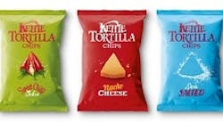
In designing the packaging, "the challenge was to keep the quality and the premium feel of Kettle … [and] appeal to a more youthful market," says Clem Halpin, design director at Turner Duckworth, whose London office created the U.K. Kettle Tortilla Chips package design.
The strong package colors and streamlined visuals were chosen to appeal to teens and young adults, while accenting the product's Mexican heritage and supporting the line's flavors. "If you put those things together — youthful target market, influenced by Mexico and really vibrant flavors — then logically you get to those really bright, vivid colors," Halpin says.
Although Kettle has established a following here in the U.S., it remains a fairly small brand in the United Kingdom, with limited advertising support. "So the packs need to work really hard in the supermarket or the grocery shop to attract attention," he adds.
That they do. The large front panel of each 160g bag is dominated by the brand name and a central image related to the flavor, like a group of chile peppers or a wedge of cheese. The rotogravure-printed bags are made from metallized film, and a matte finish is used to reinforce the brand's premium positioning.
Way bolder bags
Back in the U.S., a different type of tortilla chip is leveraging package graphics to stand out in the better-for-you section of the snack aisle. Way Better Snacks Tortilla Chips are made from premium ingredients, are preservative- and filler-free and carry several third-party certifications (for example, non-GMO and gluten-free). They are also made using sprouted grains, beans and seeds.
For the Way Better Snacks package design, brand owner Live Better Brands LLC, Islandia, N.Y., focused on the ingredients. Dominating the front of the bag for each of the six flavors is a striking photo of a key ingredient set against a pristine, white background.
"Being a natural-foods brand, we felt it was important to have clean look and had in mind creating a design using a white matte finish as a background and having a colorful focal point at the center to attract the eye," explains Jim Breen, chief executive officer of Live Better Brands.
The packaging is color-coded by flavor, with a bright but unobtrusive strip of color down the right side of the bag. The word "Sprouted" is printed vertically, in monochrome, on the side strip. Workhorse 45, Centennial, Colo., designed the package graphics and works with Live Better Brands on social media, advertising and other creative work.
Live Better Brands uses metallized OPP film for its form-fill-seal bags; metallization provides the oxygen and moisture barrier needed to protect the preservative-free chips. The flexographically printed film is reverse printed, and a matte finish is applied to the film for a premium look and feel.
Way Better Snacks are currently available in 5.5- and 1.25-oz (the latter, single-serving) bags. The brand owner plans to launch an 11-oz. "Way Bigger Bag" in June.
A crisp approach
Cleverly designed package graphics for the all-natural, premium 34 Degrees brand do double duty, attracting shoppers while providing merchandising options for retailers. Denver-based 34 Degrees packs its wafer-thin crackers, or "crisps," in paperboard boxes and, as of January, in single-serving film pouches.
"A couple of our brand signatures are the prominent logo and the bold, warm, variety-specific colors that are used on all the retail packaging, even the master case," says Jennifer Margoles, general manager at 34 Degrees. The company offers five flavors of crisps in boxes. The single-serving snack pack is used only for the brand's Natural flavor.
The 34 Degrees products are typically displayed in deli departments. Margoles says retailers like the colorful packaging and appreciate that the crisps drive sales of other deli items.
"We work to give [retailers] a lot of options for merchandising," she says. "One panel of our box can be merchandised vertically. The other can be merchandized horizontally. We give pairing suggestions and invitations to our social networks and really try to engage the consumer but also make it a lot of fun for the retailer."
Even the company's master cases are designed with merchandising in mind: Instead of plain brown corrugated board, 34 Degrees uses white corrugated printed with the flavor-specific color of the crisps inside that case.
In addition to appealing graphics, structural design is put to good advantage in 34 Degrees' retail boxes. The crisps are arranged in a paperboard tray that's wrapped with transparent film. When the tray is inserted in the box, die-cut circles in the box and tray line up to provide a view of the crisps through the film. The box panel that's designed for vertical display, and the panel designed for horizontal display, each has a round window to show off the product.
The new single-serving snack packs are designed for individual retail sale as well as inclusion in snack/meal kits and trays — with the possibility of merchandising in the cheese case. The pouches are made from OPP film, which protects the crisps from moisture and also prints well. The film is flexographically reverse printed, with the print layer sealed between two layers of OPP.
From a marketing point of view, 34 Degrees' snack pack offers "a portion-controlled packaging format which complements what we see as the rising trend across all classes of trade for higher-end, on-the-go meal and snack solutions," Margoles says. "People want portability, [and] they want the same brands that they know and love and keep in their pantry. And I think they want premium options, as well."
This article originally appeared in the April 2013 issue of Food Processing Magazine.


