Technical innovations in label formats, materials and printing are delivering marketing and operational benefits for a growing number of food processors and beverage companies.
Nestlé Waters North America, Stamford, Conn., switched to an unusual hybrid label for its Aquapod water bottle. The new label combines the features of shrink sleeves and conventional glue-applied, cut-and-stack labels. Fort Dearborn Co., Elk Grove Village, Ill., supplies Nestlé with the shrinkable cut-and-stack labels.
“The brand owner chose this label format in order to be able to utilize existing [label] application equipment,” says Fort Dearborn marketing director Gwen Chapdelaine. The labels are applied to Aquapod bottles using cut-and-stack labeling equipment and hot-melt adhesive, plus a dry-heat tunnel to shrink the label to the bottle.
In contrast to conventional cut-and-stack labels, the shrinkable version can be applied to tapered or contoured containers -- not just to bottles and jars with straight sides. The new label’s conforming characteristic was essential for the 11-oz. PET Aquapod bottle, which is shaped like a bubble with squat legs.
The Aquapod label is made from a laminated, oriented-polypropylene (OPP) structure that provides up to 15 percent shrink. The labels could be manufactured with higher-shrink films, if a processor required them.
Yes, whey
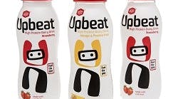
For The Good Whey Co., Cambridge, England, premium presentation and recycling figured in the choice of a full-body shrink-sleeve label for the company’s Upbeat line of high-protein dairy drinks.
Both the look and the feel of the label, which is made from Eastman Embrace HY copolyester, contribute to the Upbeat products’ positioning.
The copolyester film “provides a clean, natural white and premium look to the product’s label. In addition, the material provides a tactile, soft-to-the-touch feel,” explains Anthony Sammut, EMEA (Europe, Middle East and Asia) specification sales and marketing manager for Eastman Chemical Co., Kingsport, Tenn.
Sammut adds that the opaque labels “protect the product’s contents without having to use a colored bottle. Being able to use a clear bottle with a light-blocking material makes the bottle more valuable when it’s recycled, and using a clear bottle increases the likelihood it can emerge as a new container.”
The visual impact of a label can exert great influence over consumers and trade customers alike. That certainly has been true for Day of the Dead craft beer, which uses small-scale reproductions of specially commissioned acrylic paintings to brighten its labels and multipack carriers. The beers are sold at retail and in a growing number of restaurants.
There are six beers in the product line — Pale Ale, Blonde Ale, Hefeweizen, Amber Ale, Porter and IPA — and the label artwork for each reflects the beer’s name. The “Hop on or Die” IPA label, for example, depicts a skeleton astride a motorcycle.
For all six beers, the neck label and bottle cap are printed with the image of a skull plus brand identification. Albuquerque, N.M.-based artist Sean Wells created the paintings that are the basis for the Day of the Dead label graphics.
Day of the Dead’s brand owner, Cerveceria Mexicana, Tecate, Mexico, took an artistic approach with the labels to position the brand as artisanal and premium quality.
“What really sets us apart is we’re the very first craft beer ever to come out of Mexico,” says Joe Belli, national sales manager, Cerveceria Mexicana. “When you have such [high] quality art and labeling, you really have to have good product inside the bottle.”
He adds, “We spent a lot of time perfecting the recipes. We went through 42 different recipes to come up with these six.”
The brand owner added an interesting twist to the label by incorporating twin perforations that run down the side of package. These make it easy for consumers to remove the label before tossing the bottle in the recycling bin and also make “the clear PET bottle easier to detect and divert to the correct recycling stream,” Sammut says.
The Upbeat product comes in two flavors, Mango & Passion Fruit and Strawberry, with the labels color-coded by flavor. “Upbeat is made with real fruit, so they also have an image of the fruit on them,” says Susie Hignett, Good Whey brand manager.
Label converter CCL Label Decorative Sleeves, Norfolk, England, prints the labels using UV flexography. CCL prints the Strawberry label in six colors plus white, and it prints the Mango & Passion Fruit label in seven colors plus white.
On a first-name basis
Digital label-printing technology powered a Coca-Cola branding campaign that generated considerable buzz in the packaging community in 2013. Coca-Cola Co., Atlanta, worked with 18 label converters throughout Europe to produce nearly 800 million personalized labels for its Share a Coca-Cola campaign. The brand owner distributed the limited-time bottles in 32 countries.
Each of the labels was printed with a first name that’s common in the country or region where the bottle would be sold. The name appeared on the front of the label where the Coca-Cola logo is normally printed, and in roughly the same size. In each country, 150 names specific to the locale were used — representing a total of 15 languages and five alphabets.
The campaign, which targeted teenagers, also included a social media component. The Share a Coca-Cola website provided a Share Wall where consumers could share a virtual Coca-Cola decorated with a friend’s name, even if that name wasn’t on the labels.
Creating the massive number of personalized labels needed for the campaign required a combination of conventional and digital printing. Ten label converters printed the labels with all the standard information, such as nutritional facts, using conventional presses. Then another eight converters printed the names on the labels with digital presses. The substrate for the wraparound labels was a 38-micron, biaxially oriented polypropylene (BOPP) film.
Hewlett-Packard Co., Palo Alto, Calif., supplied the HP Indigo WS6000 presses used for the digital printing. To assure color consistency and protect Coca-Cola’s brand equity, HP formulated a special red ink for the personalized labels that’s an exact match for the color on the regular labels.
After the various printing steps, the personalized labels were applied to 375- and 500-ml PET bottles of Coca-Cola, Coca-Cola Light and Coca-Cola Zero on existing high-speed bottling lines.


